


Introduction
In Part 1, we built an application to geographically explore the 500 Cities Project dataset from the CDC. In this post, we will demonstrate other exploratory data analysis (EDA) techniques for exploring a new dataset. The analysis will be done with R packages data.table, ggplot2 and highcharter.
In this post, you will learn how to:
- Build a boxplot
- Build and plot a correlation matrix
- Build a histogram
Load Dataset
It may take a few minutes to download the data. The data is also available here.
library(data.table)
df <- fread('https://chronicdata.cdc.gov/api/views/9z78-nsfp/rows.csv?accessType=DOWNLOAD')
The dataset contains values from cities across the country for 28 separate health measures. The full measure names are cumbersome so for the remainder of the post, we will use the Short_Question_Text which is an abbreviated form of the full measure name. Here are the full measure names and their corresponding abbreviations for reference.
##                                     Measure            Short_Question_Text
## 1  Current lack of health insurance among a               Health Insurance
## 2    Arthritis among adults aged >=18 Years                      Arthritis
## 3  Binge drinking among adults aged >=18 Ye                 Binge Drinking
## 4  High blood pressure among adults aged >=            High Blood Pressure
## 5  Taking medicine for high blood pressure            Taking BP Medication
## 6  Cancer (excluding skin cancer) among adu           Cancer (except skin)
## 7  Current asthma among adults aged >=18 Ye                 Current Asthma
## 8  Coronary heart disease among adults aged         Coronary Heart Disease
## 9  Visits to doctor for routine checkup wit                 Annual Checkup
## 10 Cholesterol screening among adults aged           Cholesterol Screening
## 11 Fecal occult blood test, sigmoidoscopy,     Colorectal Cancer Screening
## 12 Chronic obstructive pulmonary disease am                           COPD
## 13 Physical health not good for >=14 days a                Physical Health
## 14 Older adult men aged >=65 Years who are  Core preventive services for o
## 15 Older adult women aged >=65 Years who ar Core preventive services for o
## 16 Current smoking among adults aged >=18 Y                Current Smoking
## 17 Visits to dentist or dental clinic among                   Dental Visit
## 18 Diagnosed diabetes among adults aged >=1                       Diabetes
## 19 High cholesterol among adults aged >=18                High Cholesterol
## 20 Chronic kidney disease among adults aged         Chronic Kidney Disease
## 21 No leisure-time physical activity among               Physical Activity
## 22 Mammography use among women aged 50–74 Y                    Mammography
## 23 Mental health not good for >=14 days amo                  Mental Health
## 24     Obesity among adults aged >=18 Years                        Obesity
## 25 Papanicolaou smear use among adult women                 Pap Smear Test
## 26 Sleeping less than 7 hours among adults                           Sleep
## 27      Stroke among adults aged >=18 Years                         Stroke
## 28 All teeth lost among adults aged >=65 Ye                     Teeth Loss
Boxplots
Boxplots graphically depict groups of numerical data through their quartiles. Outliers are shown as points above and below the boxes. This is a good first step in EDA because it shows the range of values associated with each measure. Here we will build a boxplot for each measure in the dataset grouped by category. Each boxplot is built from 500 values, one value for each city.
library(ggplot2)
df_subset <- df[df$GeographicLevel == 'City',]

# grouped boxplot
ggplot(df_subset, aes(x=substr(Short_Question_Text, 1,40), y=Data_Value, fill = Category )) +
    geom_boxplot() +
  theme(axis.text.x = element_text(angle = 90, hjust = 1), legend.position = 'bottom') +
  facet_wrap(~Category,scales = "free_x") + xlab('Measure') + ylab('Percentage')
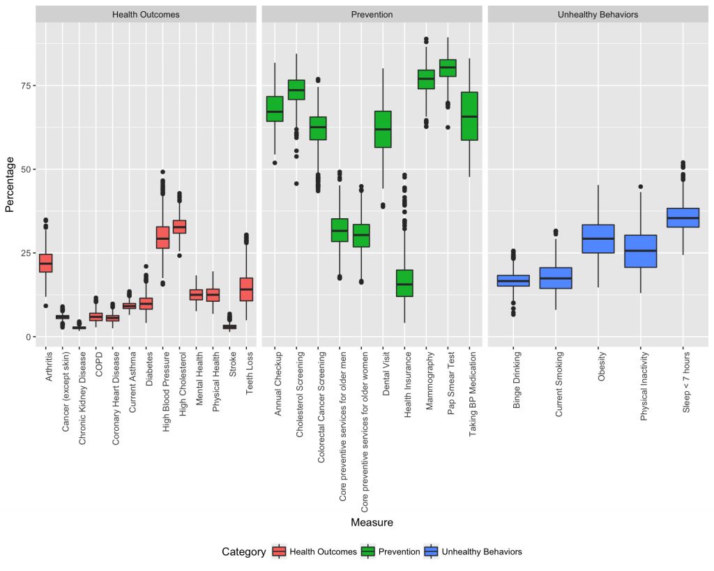
The boxplots show a wide distribution for most of the measures, especially among the preventive measures. Next we will analyze dependence between measures.
Correlation Plot
The second EDA technique we will demonstrate is a correlation plot which is used to show dependence between measures. The correlation between measures is given by a number between -1 and 1 (1 means perfectly positively correlated and -1 means perfectly negatively correlated). The dataset contains values for each measure at three different geographic levels: US, City, and Census Tract. To compute the correlations, we will use data at the Census Tract level which is the smallest geographic level. The correlation plot will compare the measure values at each Census Tract to determine their correlation coefficient.
The steps to compute a correlation matrix in R are as follows:
- Subset the dataset to select only the necessary columns
- Convert the dataset to a wide-format
- Calculate correlations
- Plot the correlation matrix
Subset the dataset
We only want the location (UniqueID), the measure (Short_Question_Text) and the value (Data_Value) columns in our dataset. We only want rows where GeographicLevel is Census Tract. We subset the dataset to remove the rows and columns which aren’t relevant to our analysis.
df_subset <- df[GeographicLevel == 'Census Tract', c('UniqueID','Short_Question_Text', 'Data_Value')]
head(df_subset)
##               UniqueID Short_Question_Text Data_Value
## 1: 0107000-01073000100    Health Insurance       27.6
## 2: 0107000-01073000300    Health Insurance       32.2
## 3: 0107000-01073000400    Health Insurance       31.8
## 4: 0107000-01073000500    Health Insurance       33.7
## 5: 0107000-01073000700    Health Insurance       38.4
## 6: 0107000-01073000800    Health Insurance       26.5
Convert to Wide Format
The R correlation function cor() requires that the dataset is in wide-format. The dcast function from the data.table package simplies the task of converting the dataset into wide-format. Essentially, the dcast function creates a new column for each unique Short_Question_Text (i.e. it ‘casts’ the Short_Question_Text into wide format) and inputs the Data_Value as the value for that column. The UniqueID is designated as the row name because it is not actually part of the correlation calculation.
df_wide <- dcast(df_subset, UniqueID ~ Short_Question_Text, value.var = 'Data_Value')
row.names(df_wide) <- df_wide$UniqueID
df_wide$UniqueID <- NULL
df_wide <- df_wide[complete.cases(df_wide),] #Removes any rows with NA values
head(df_wide[,1:5])
##    Annual Checkup Arthritis Binge Drinking COPD Cancer (except skin)
## 1:           76.6      34.0           10.3 11.2                  5.5
## 2:           74.0      32.8           11.0 11.1                  5.0
## 3:           77.5      37.2            9.3 12.9                  5.6
## 4:           78.7      40.1            8.4 14.4                  6.1
## 5:           78.4      40.2            7.4 15.6                  6.0
## 6:           81.1      40.7            8.8 12.5                  7.0
Compute Correlation Matrix
Now that the data is in the appropriate format, we can use the R function cor() to compute the correlations. We apply the cor() function to the wide-format data to compute the correlation between measures.
cor_plot <- cor(df_wide)
cor_plot <- round(cor_plot, 2)
head(cor_plot[,1:5])
##                       Annual Checkup Arthritis Binge Drinking  COPD
## Annual Checkup                  1.00      0.57          -0.35  0.29
## Arthritis                       0.57      1.00          -0.61  0.81
## Binge Drinking                 -0.35     -0.61           1.00 -0.63
## COPD                            0.29      0.81          -0.63  1.00
## Cancer (except skin)            0.47      0.65          -0.25  0.20
## Cholesterol Screening           0.65      0.44          -0.14 -0.03
##                       Cancer (except skin)
## Annual Checkup                        0.47
## Arthritis                             0.65
## Binge Drinking                       -0.25
## COPD                                  0.20
## Cancer (except skin)                  1.00
## Cholesterol Screening                 0.75
As you can see, the output is a dataframe with values between 1 and -1. We will plot this result to make it easier to understand and analyze.
Plot the Correlation Matrix with Highcharts
Highcharter is an R wrapper for the Highcharts library. Highcharts is a data visualization library which makes it simple to develop interactive charts. The hchart() function can be applied to the R correlation function output to build a correlation plot.
library(highcharter)
hchart(cor_plot)
Reorder the Correlation Plot
While this is better than the tabular form, we can make it more clear by grouping correlated features together. We will use a helper function which I found here to reorder the correlation plot.
reorder_cormat <- function(cormat){
# Use correlation between variables as distance
dd <- as.dist((1-cormat)/2)
hc <- hclust(dd)
cormat <-cormat[hc$order, hc$order]
}

cor_plot <- reorder_cormat(cor_plot)
hchart(cor_plot)
The correlation plot yields some interesting insights. The first thing I noticed is that binge drinking is negatively correlated with many of the poor health outcomes (e.g. obesity, high cholesterol, stroke, diabetes). My first thought on this is that binge drinking is more common among young people who generally don’t have as many health issues as older people. However we would need to analyze data on binge drinking more extensively to derive solid conclusions.
Another insight is lack of health insurance is positively correlated with negative health outcomes (i.e. people without health insurance experience worse health outcomes). This is interesting although not surprising. In the next section, we will drill into the health insurance measure to analyze how it differs across the nation.
Health Insurance Histograms
First, we will compute the summary statistics and build a histogram for health insurance across the dataset by city.
df_health <- subset(df, Short_Question_Text == 'Health Insurance')
df_health <- subset(df_health, GeographicLevel == 'City' & DataValueTypeID == 'AgeAdjPrv')
summary(df_health$Data_Value)
##    Min. 1st Qu.  Median    Mean 3rd Qu.    Max.
##    4.10   13.28   17.40   18.21   22.12   49.00
There is a wide range of health insurance coverage across the cities in the dataset with a difference between the best and worst of about 45 percent.
hist(df_health$Data_Value, col = 'gray', breaks = 20)
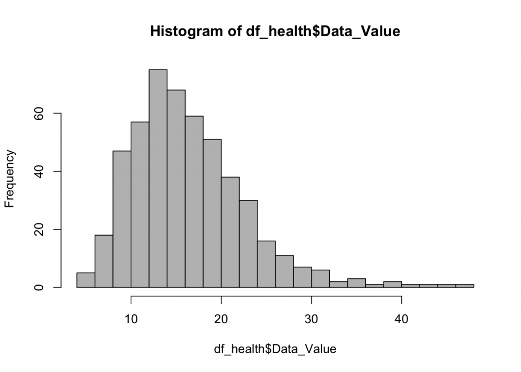
The histogram shows the data is skewed to the right.
Next, we will find the cities which have the highest percentage of their population lacking health insurance.
library(ggplot2)
df_health <- subset(df, Short_Question_Text == 'Health Insurance')
df_health <- subset(df_health, GeographicLevel == 'City' & DataValueTypeID == 'AgeAdjPrv')
df_health <- df_health[order(df_health$Data_Value, decreasing = TRUE),]
df_health$City <- paste0(df_health$CityName, ',', df_health$StateAbbr)

ggplot(df_health[1:20,], hcaes(x = reorder(City, Data_Value), y = Data_Value, fill = Data_Value)) +
geom_bar(stat = "identity",col = "black")+
  theme(axis.text.x = element_text(angle = 90, hjust = 1), legend.position = 'none') +
  ggtitle('The 20 cities in the USA with the lowest percentage of health insurance', subtitle = 'Texas leads the way with 6 of the top 7') +
  xlab('City') + ylab('Percent Uninsured')
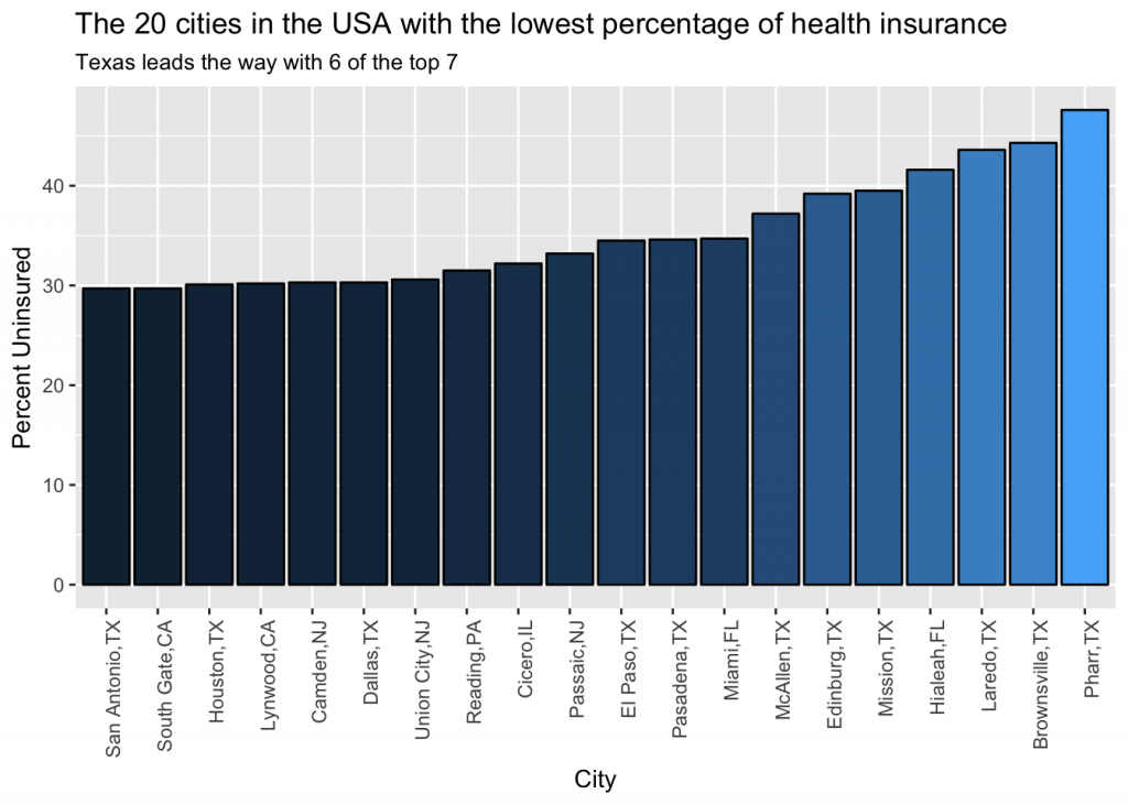
Pharr, TX leads the way with nearly half of their population lacking health insurance and Texas leads the way with 6 of the top 7 cities.
However Texas is a large state and they may simply have more cities in the dataset than other states. Next we will calculate the ratio of cities from each state in the top 100 with regards to lack of health insurance in comparison to the total number of cities in the dataset. The steps to complete this calculation are:
- Select the top 100 cities by lack of health insurance
- Count cities in the top 100 for each state
- Count the total cities in the dataset for each state
- Divide the number of cities in the top 100 by the total number of cities in the dataset
Select the top 100 cities by lack of health insurance.
#Subset dataset
df_health <- subset(df, Short_Question_Text == 'Health Insurance')
df_health <- subset(df_health, GeographicLevel == 'City' & DataValueTypeID == 'AgeAdjPrv')
df_health <- df_health[order(df_health$Data_Value, decreasing = TRUE),] #Order rows by Data_Value
df_health_100 <- df_health[1:100,] #Select only the top 100 rows
head(df_health_100[,1:5])
##    Year StateAbbr StateDesc    CityName GeographicLevel
## 1: 2014        TX     Texas       Pharr            City
## 2: 2014        TX     Texas Brownsville            City
## 3: 2014        TX     Texas      Laredo            City
## 4: 2014        FL   Florida     Hialeah            City
## 5: 2014        TX     Texas     Mission            City
## 6: 2014        TX     Texas    Edinburg            City
Count the number of cities in the top 100 by state using the aggregate function.
agg_100 <- aggregate(df_health_100$Year, by = list(df_health_100$StateDesc), FUN = length)
agg_100 <- agg_100[order(agg_100$x, decreasing = TRUE),]
head(agg_100)
##       Group.1  x
## 21      Texas 29
## 3  California 25
## 6     Florida 10
## 16 New Jersey  7
## 7     Georgia  4
## 12  Louisiana  3
Plot the results.
library(ggplot2)
ggplot(agg_100, aes(x = reorder(Group.1, x), y = x, fill = x)) +
geom_bar(stat = "identity",col = "black")+
  theme(axis.text.x = element_text(angle = 90, hjust = 1), legend.position = 'none') +
  ggtitle('Number of cities in top 100 for percent uninsured by state', subtitle = 'Texas and California lead the way by a wide margin') +
  xlab('State') + ylab('Percent Uninsured')
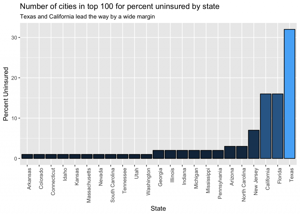
We can see Texas and California lead the way with the most cities in the top 100. This makes sense because they are two of the largest states.
Count the number of cities in the dataset for each state.
df_health <- subset(df, Short_Question_Text == 'Health Insurance')
df_health <- subset(df_health, GeographicLevel == 'City' & DataValueTypeID == 'AgeAdjPrv')
agg <- aggregate(df_health$Year, by = list(df_health$StateDesc), FUN = length)
agg <- agg[order(agg$x, decreasing = TRUE),]

#Plot the top 20
ggplot(agg[1:20,], aes(x = reorder(Group.1, x), y = x, fill = x)) +
geom_bar(stat = "identity",col = "black") +
  theme(axis.text.x = element_text(angle = 90, hjust = 1), legend.position = 'none') +
  ggtitle('The number of cities from each state in the 500 Cities dataset (Top 20)', subtitle = 'California leads the way by a wide margin') +
  xlab('State') + ylab('Number of Cities')
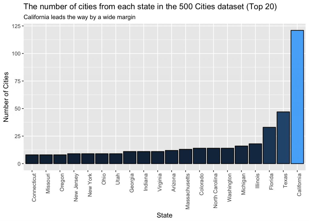
California and Texas also lead the way with the most cities in the top 100. Now, we will divide the number of cities in the top 100 by the total number of cities in the dataset to create a more accurate comparison of states.
agg_merged <- setNames(merge(agg_100, agg, by = 'Group.1'), c('city', 'health_cities', 'total_cities'))
agg_merged$Ratio <- agg_merged$health_cities / agg_merged$total_cities
head(agg_merged)
##          city health_cities total_cities      Ratio
## 1     Arizona             1           12 0.08333333
## 2    Arkansas             1            5 0.20000000
## 3  California            25          121 0.20661157
## 4    Colorado             1           14 0.07142857
## 5 Connecticut             1            8 0.12500000
## 6     Florida            10           33 0.30303030
Plot the ratio to see how the states compare.
ggplot(agg_merged, aes(x = reorder(city, Ratio), y = Ratio, fill = Ratio)) +
geom_bar(stat = 'identity', color = 'black')+
  theme(axis.text.x = element_text(angle = 90, hjust = 1), legend.position = 'none') +
  ggtitle('Ratio of number of cities in the top 100 over number of cities in the dataset') +
  xlab('State')
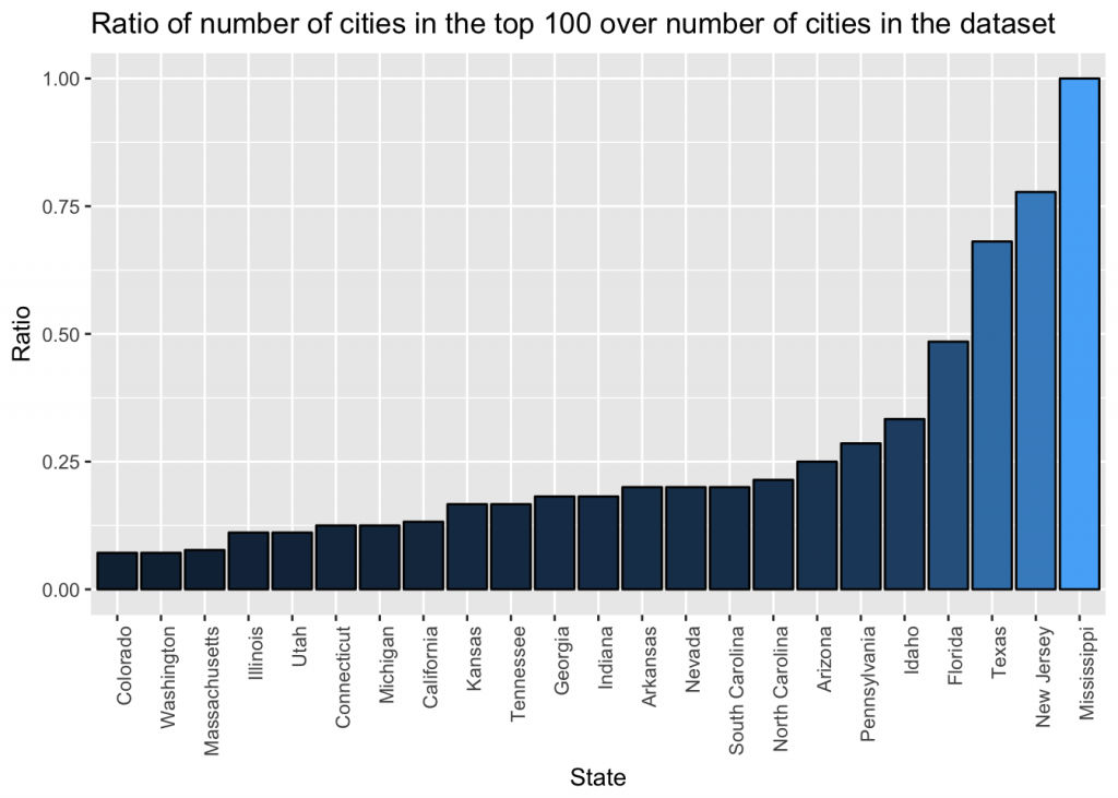
The plot now paints a different picture then the raw data. New Jersey leads the way with nearly 80% of their cities in the top 100.
Th purpose of this post was to demonstrate common exploratory data analysis techniques. The goal of exploratory data analysis is to provide an understanding of the dataset and generate questions to analyze further. From this analysis, I would be curious as to why New Jersey lacks health insurance. I would also be curious if the lack of health insurance actually causes poor health outcomes, or if there are other factors in play.
As you delve deeper into datasets, you will almost always generate questions that you didn’t think of prior to starting the analyis. This is the one of the key values of EDA.
Contact Red Oak Strategic
.png)
Analytics
AWS Summit 2026 Reflection: From Possibility to Production Execution Last year at AWS Summit in Washington, DC, the AI conversation still ha...


Data
Introduction This is the first installment of a three-part technical series detailing the end-to-end observability and log tracking architec...


Data
The Problem: AI Pilots Are Easy to Start and Hard to Scale AI is no longer a future-state conversation for most organizations. Leadership te...
